
BQE Software
Financial software for architecture firms.
Empowers architecture firms to optimize their projects to increase profitability. Product features included management tools for contracts, expenses, invoicing, reporting and time cards.

Major Usability Problems
- Learning curve was steep and easy to forget
- Simple tasks required intricate knowledge of the application
- Lack of way finding and guidance
- Most pages were forced into the same data table component
Conceptual Solution
- Leadership brainstormed with their SME’s and came to the conclusion to reorganize around projects.
- This new “Project Centric” concept was pitched as a better match the user’s mental model.
- After some turnover on the leadership team, the concept was left in an unfinished state.
Working within Ambiguity
Gather Existing Knowledge
- Recent customer interviews (what have we heard)
- Internal knowledge (what we have learned of the years)
- Evaluating similar products (what do people expect)
- Technical research (what can we realistically build)
Findings
- Customers need quick access to their data
- Customers needed expertise and patience find their data.
- They had to load too many pages to get a complete overview.
- If they forgot to visit a page, they may have missed an issue that needed attention.
- Customers were not using certain features because they didn’t know how.
- Even without using all the features, customers were overwhelmed by the number of fields each page presented.
- Many fields were had cryptic labels with no descriptions.
Information Architecture
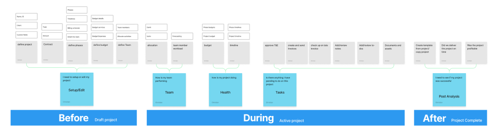
I did a content audit and explore multiple organization models. After collaborating with the product managers, we converged on a time-based model.
Before Project (Planning)
- Show only fields needed to setup a project
- Support an iterative step up across many days.
During Project (Execution)
- Show important pending items that need immediate attention.
- Display the progress on the project timeline
- Display the cost of the project to-date
- Display the workload on the team members to avoid burnout or excessive idle time
After Project Completion (Post Analysis)
- Focus the display on how successful or not the project ended up for the firm
- Help the firm owner and project manager identify if this is an ideal type of project for them
Guide the user
A content strategy was proposed as a foundational design principal.
- Clear page headers to orient users.
- Add in-line instructions to fields and sections.
- Clearly communicate how settings impact the rest of the application.
Designing Across Time
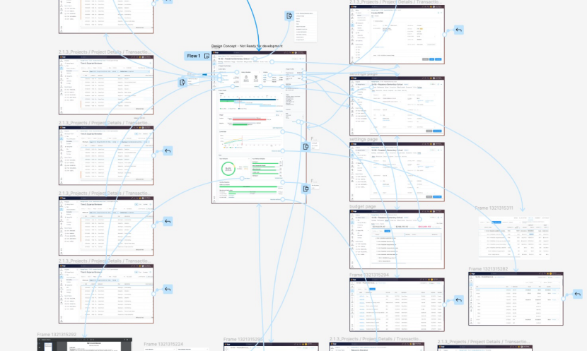
Broad Breadth Prototype
The prototype focused on high breadth fidelity. All linked pages were included. This gave a clear picture of how it would all work together and what would be impacted. We were then able to explore various priority orders.
Project Hub - During State
The “During state” of the project was prioritized to be detailed first as it would provide the most value to users with the lowest tech impact.
All pieces of content were reviewed with a critical eye and vetted.
BQE was using SyncFusion for their graphing library. I dove into the library documentation to find the options and limitations. I built code examples through StackBlitz and delivered easy to implement solutions.
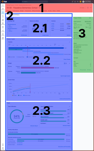
Information Hierarchy
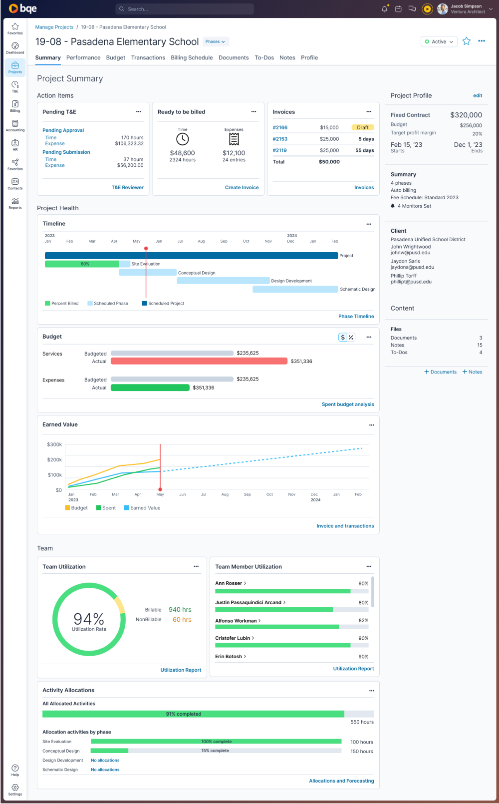
1 - Header
- Introduced a breadcrumb for improved way finding and navigation
- Improved usability of the phase selector
- Maintained tab structure for the first phase, reducing impact to other pages
- Introduced a content header
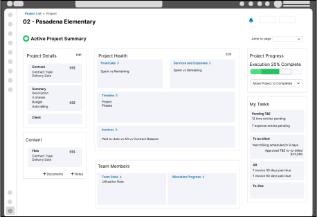
2 - Active Project Summary
- While the project is active, the project activities and health is brought to the forefront
2.1 - Action Items
- Top section of page bubbled up actionable tasks the PM should focus on
- Modules introduced menus for addition features
- Each module filtered and focus content to most important data
2.2 - Project Health
- Project heath was deemed the top data point PMs needed to review
- Project timeline was visualized using more selective set of graph settings
- Budget visualization was improved to more clearly present Budgeted vs Actual
- Earned Value was a hidden feature that was brought to the forefront and the projection was added to more accurately present the concept
2.3 - Team Health
- Team health was the second main piece of content to be reviewed by PMs
- Utilization was previously hidden
- Team member utilization was introduced as a graph
- Visualizing activity allocations was introduced by project
3 - Project Profile
- Identifying and qualifying project details were surfaced to help reacquaint users to the project
- Content was presented in read only to reduce cognitive load and improve ease of scanning
- Multiple client contacts were introduced
Project Outcomes
User Value
- Reduced risk of missing critical information
- Faster access to more information
- Leverage more features in BQE suite
- Reduce learning curve
Business Value
- Reduced risk of missing critical information
- Faster access to more information
- Leverage more features in BQE suite
- Reduce learning curve
Tech Value
- Reduced risk of missing critical information
- Faster access to more information
- Leverage more features in BQE suite
- Reduce learning curve
To hear about the long term business value I provided, book a meeting with me.